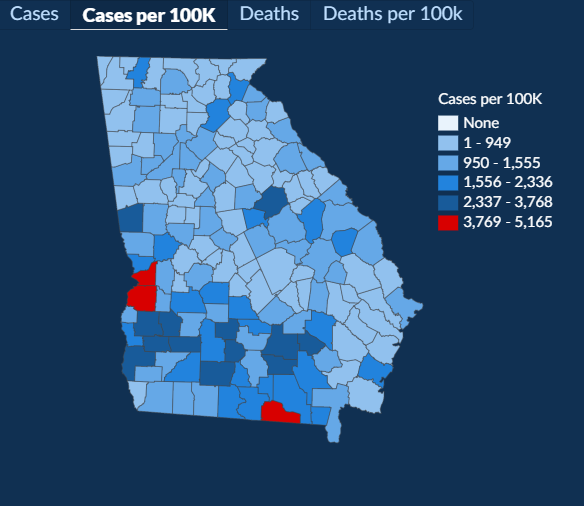
Never mind the fact that all the ranges are different size, this map's 1st range topped at 500 a couple days ago. The edit made to change that conveniently kept my county from changing to a higher tier. It also makes the rate of infections throughout the state seem static at a county level when they aren't.
Given the ridiculous setup of the rest of the Georgia DPH data, it's not necessarily the case that this isn't just putting a rank amateur in charge of data, but I guess I have more fodder for the data unit if I end up teaching face to face.
